Cherkam Robotics: Case Study
My internship at Marketing.ink in Peterborough provided me with many great opportunities to practice logo and brand creation. While I do enjoy creating a brand from scratch, there is a fascination I have with rebranding. For me it means a chance to revive, or revolutionize a current brand.
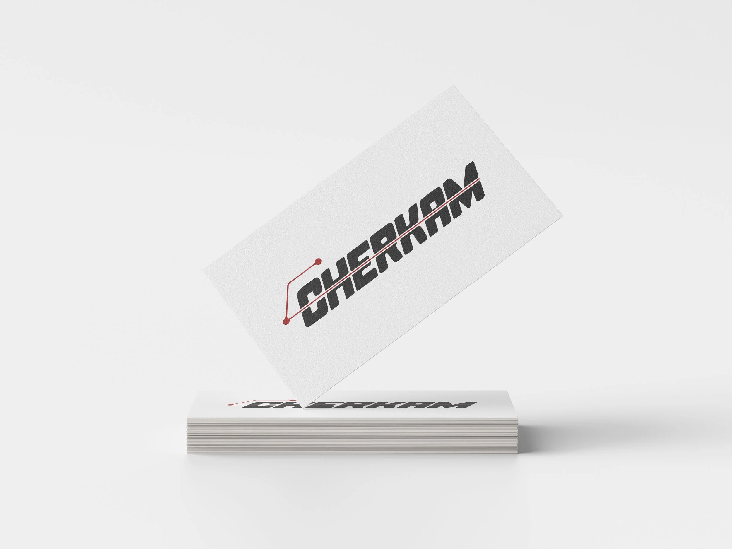
At the start, I was essentially given a business card with their logo.
The logo was alright, but what did it share about the brand? Could it be scaled and be used across platforms? Did it carry the tone of the business it represented?

This is what I ended up arriving at.

The bottom line is that Cherkam is a sophisticated robotics industry that to the passerby it could have been an internet service provider, insurance company, or just about anything. I wanted the glyph to be unmistakably Cherkam. I used a robotic arm as reference, then simplified it so it would maintain recognition when resized. Additionally, I had seen that the arm could form the letter “C” for Cherkam, so it could work as a standalone.
Let’s talk type. I wanted to give the brand typography that was pronounced for headings and subheadings. I wanted it to feel modern and sophisticated. So I found the beautiful Mr Eaves Mod OT Regular to handle that job. To compliment it, I went the serif route, with Adobe Caslon Pro for body copy and descriptions. I think that when paired well, serifs and san-serifs work hand in hand.

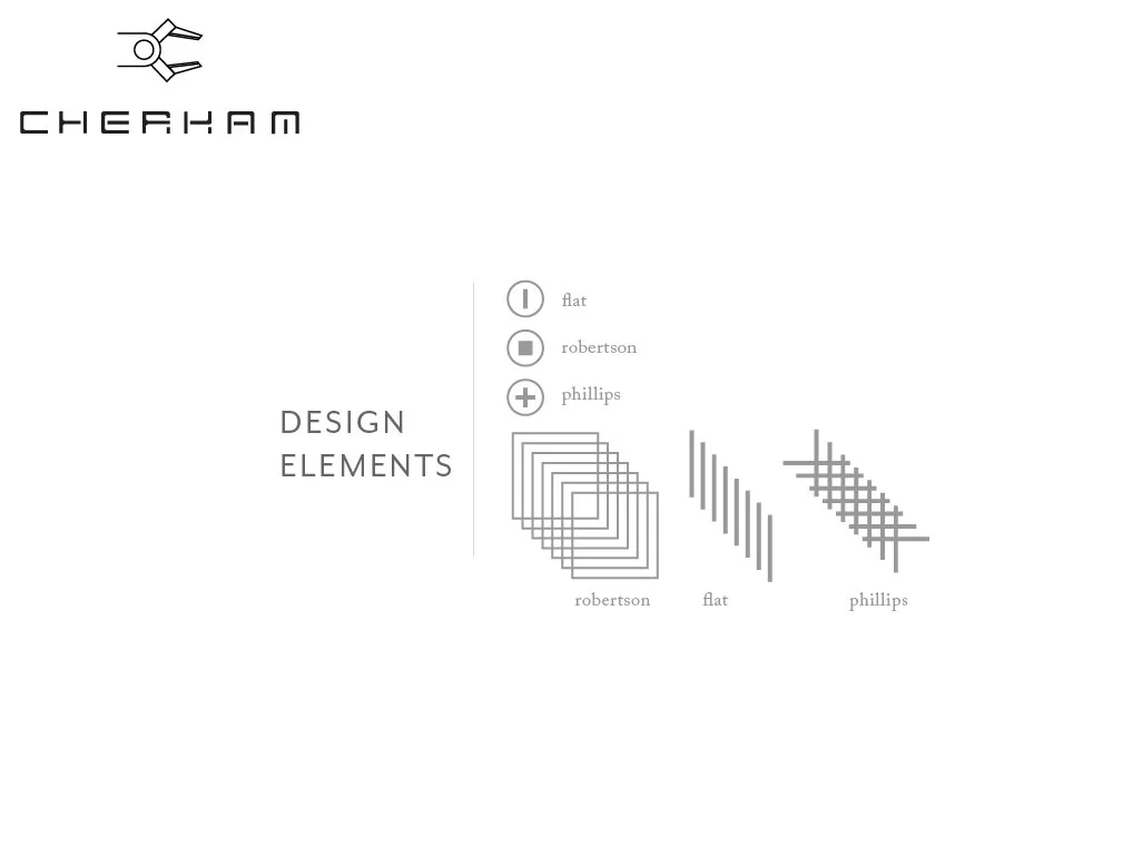
Elements. Every brand needs them, but how could I create elements that still felt robust and on-brand? I chose to use typical screw heads many industrial workers would be familiar with, and transformed them into bullet points, patterns, and everything in between.
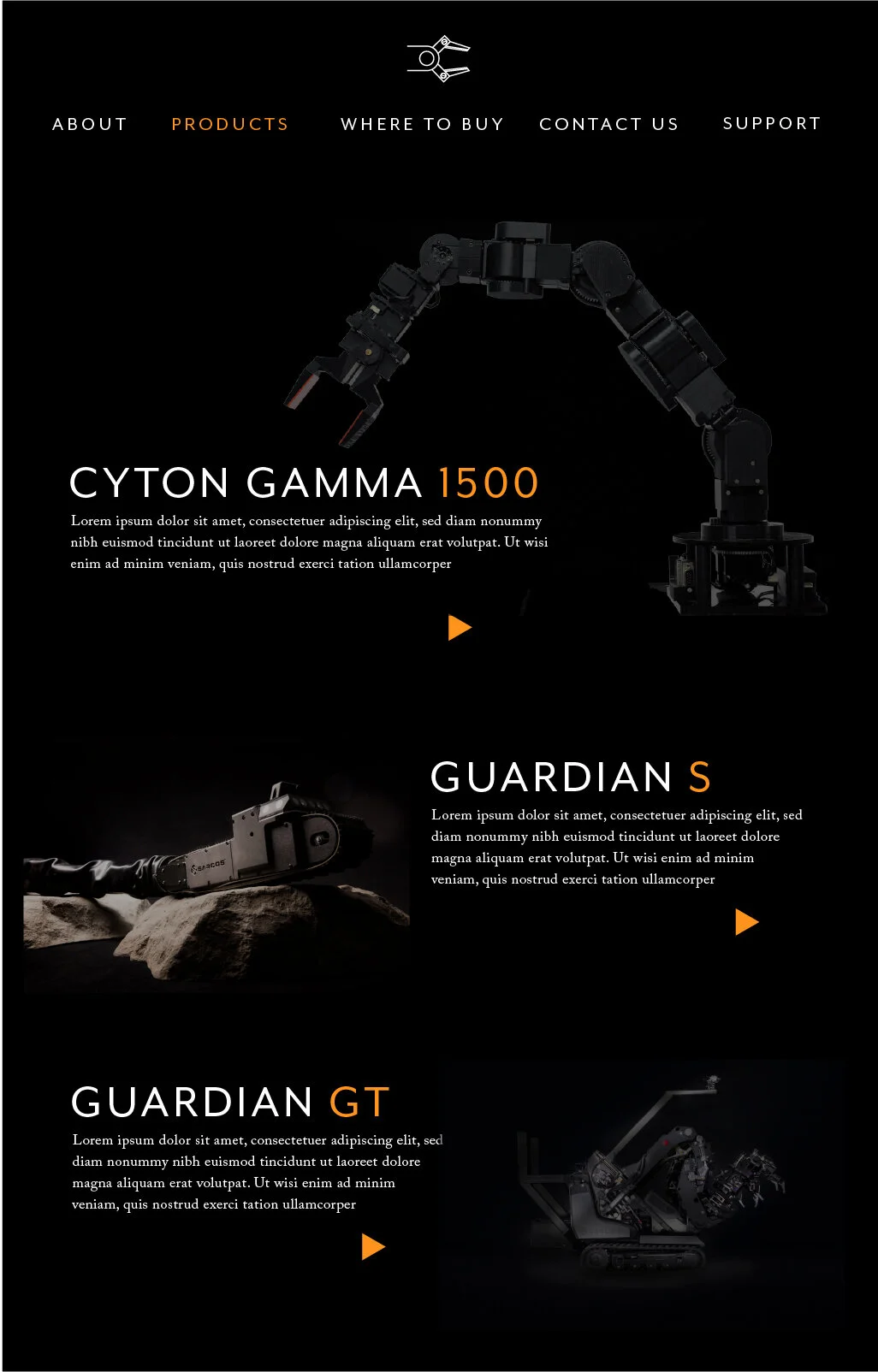
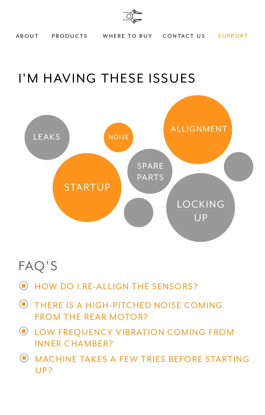
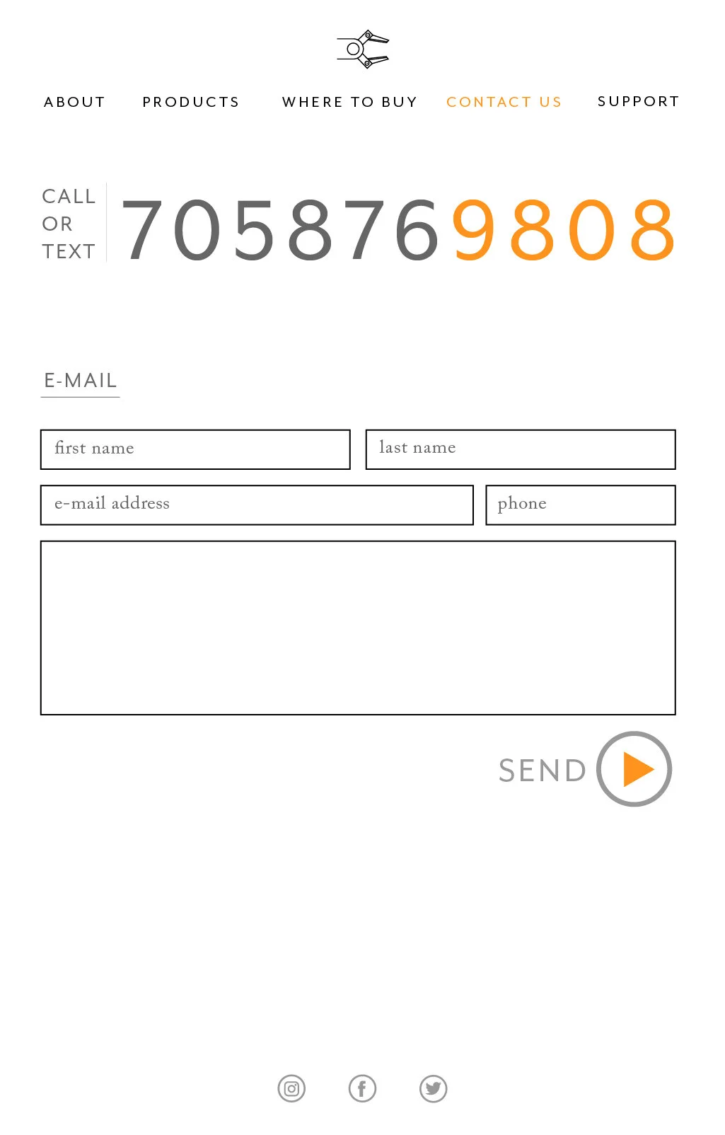
Let’s talk web.