
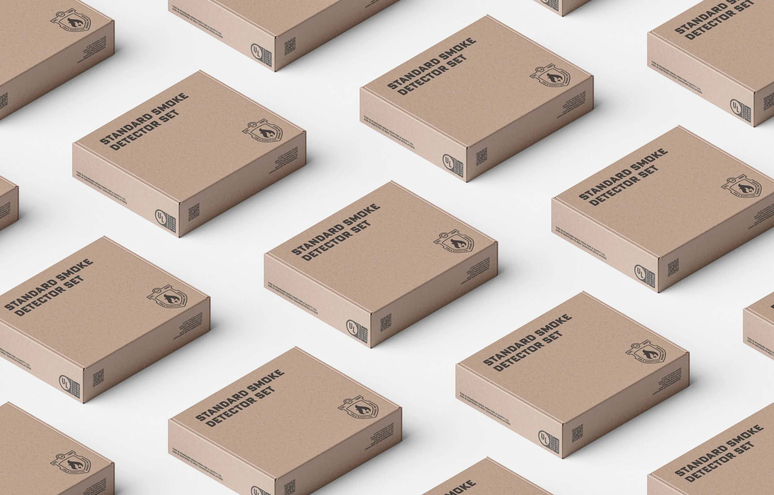
You can still find a big fish in a small pond.
My company had been commissioned by the Fire & Safety Department in Omemee to design a new logo. This is how that process went.

Where they were was not too exciting, and what they were looking for was not exactly my idea of strong design. Regardless, sometimes you need to give what the doctor ordered. I followed the inspiration they had, and whipped them up in an efficient but effective manner.
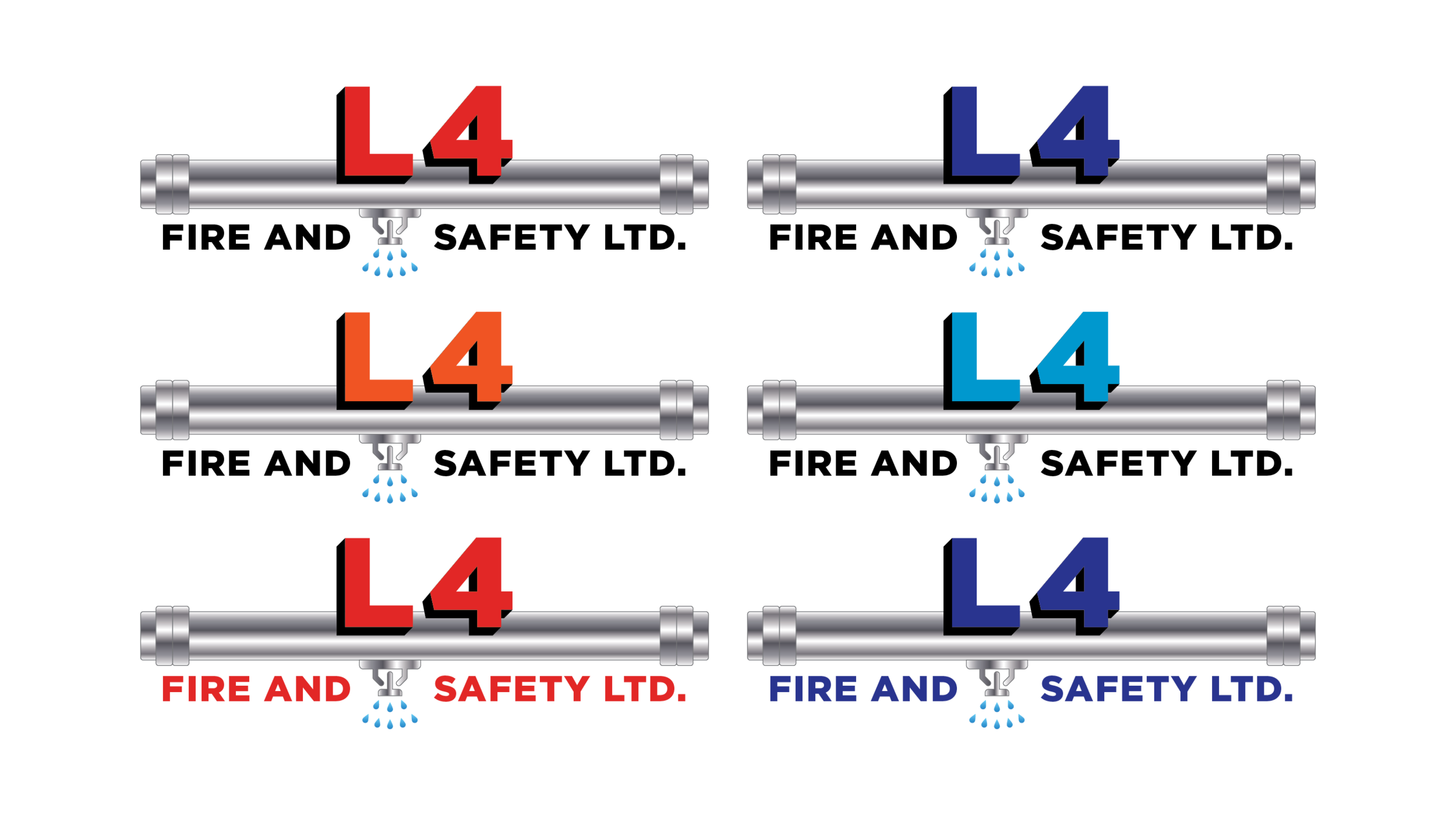
This was another option they had in mind, it had some interesting features but not quite my tempo. I did have some fun making the metal gradients, and designing in symmetry can be fun. When you’re doing work you don’t necessarily enjoy, it’s important to find the good in it.
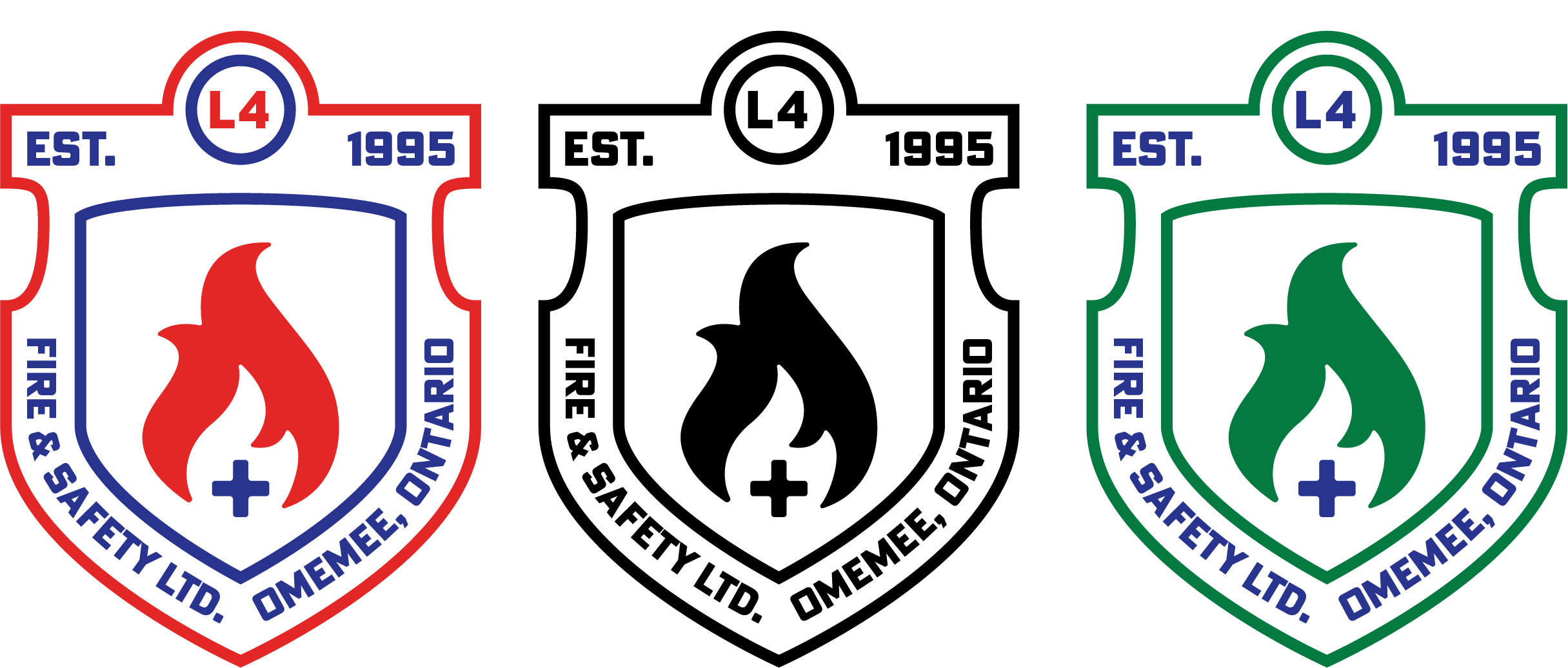
Ah yes, now to when I cracked my knuckles, popped in some headphones, and put in some time. I spent a lot of time on Aaron Draplin’s site, and took some pointers on typography and stroke work. There was quite a bit of time that went into it until the crest was just right. Then I did more.

This one is more of some tweaking and playing around with negative space. It was the result of the infamous, “what if?” question. What if I dropped these points down, and then put this over here, and then, ooooooo “I like that.” It’s important in design to understand the playfulness of our craft.
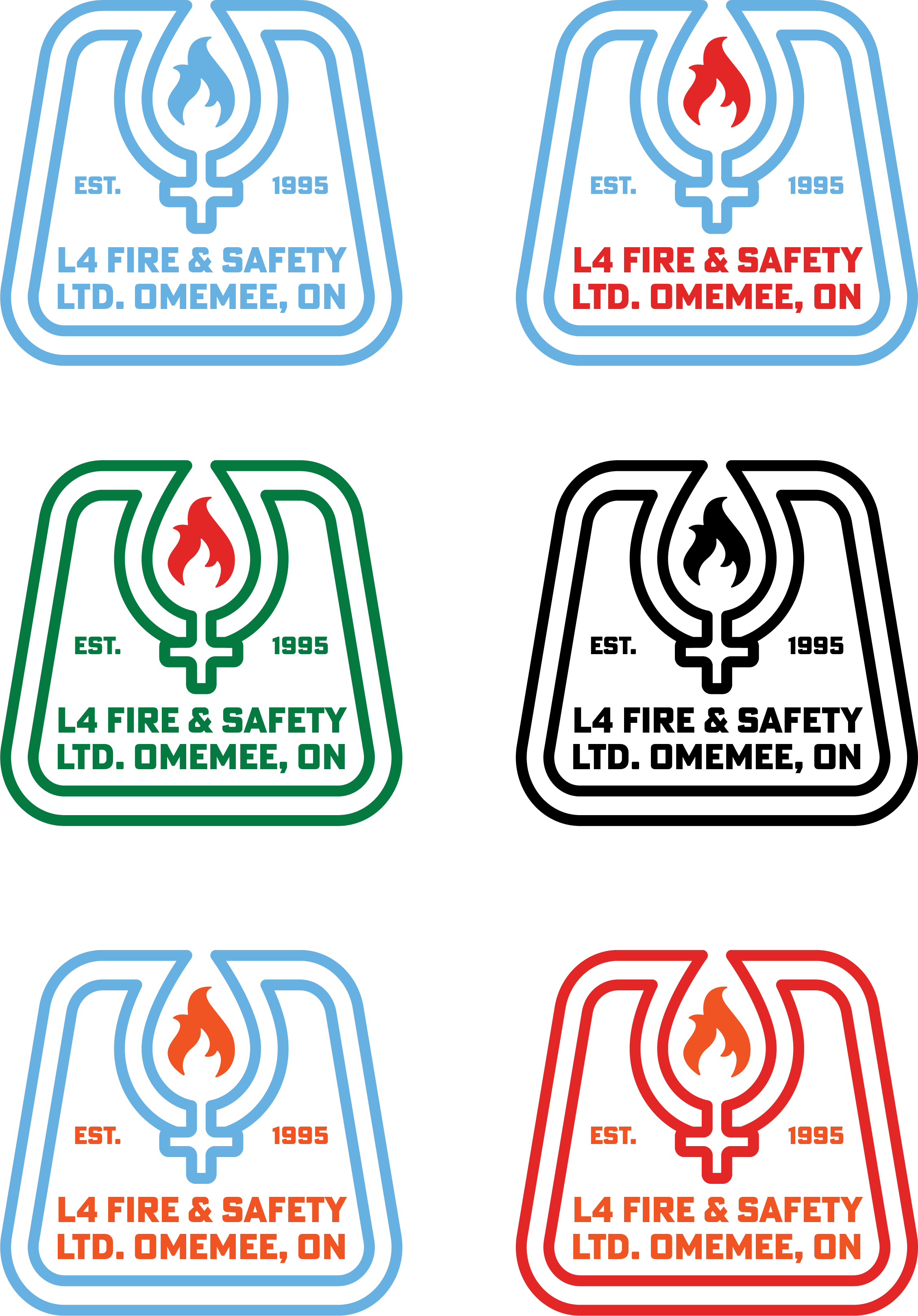
These were in a different shape, and I focused more on the symbols. With the flame trapped inside the water droplet to represent the effectiveness of the department. These are the kinds of logos that someone might look at and say, I could do that. What makes a logo strong is not the fact that only a designer can make it, it’s that only a creative can think of it. Good work is not entitled to the professionals, it’s delivered by those who take the time to think of things that will create an impact.