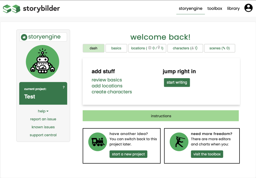
The original StoryEngine had great ideas and layout for the time being, but now felt fragmented from the new interface structure.
In mock 1 I focused on bringing the rounded corners, adding in familiar iconography and cutting less important information out to further simplify the user experience.
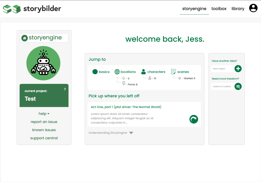
In mock 2 I reverted back to some of the original features to keep familiarity for existing users. I also added more preview ideas, so users could get more pertinent information before clicking into areas for further information.
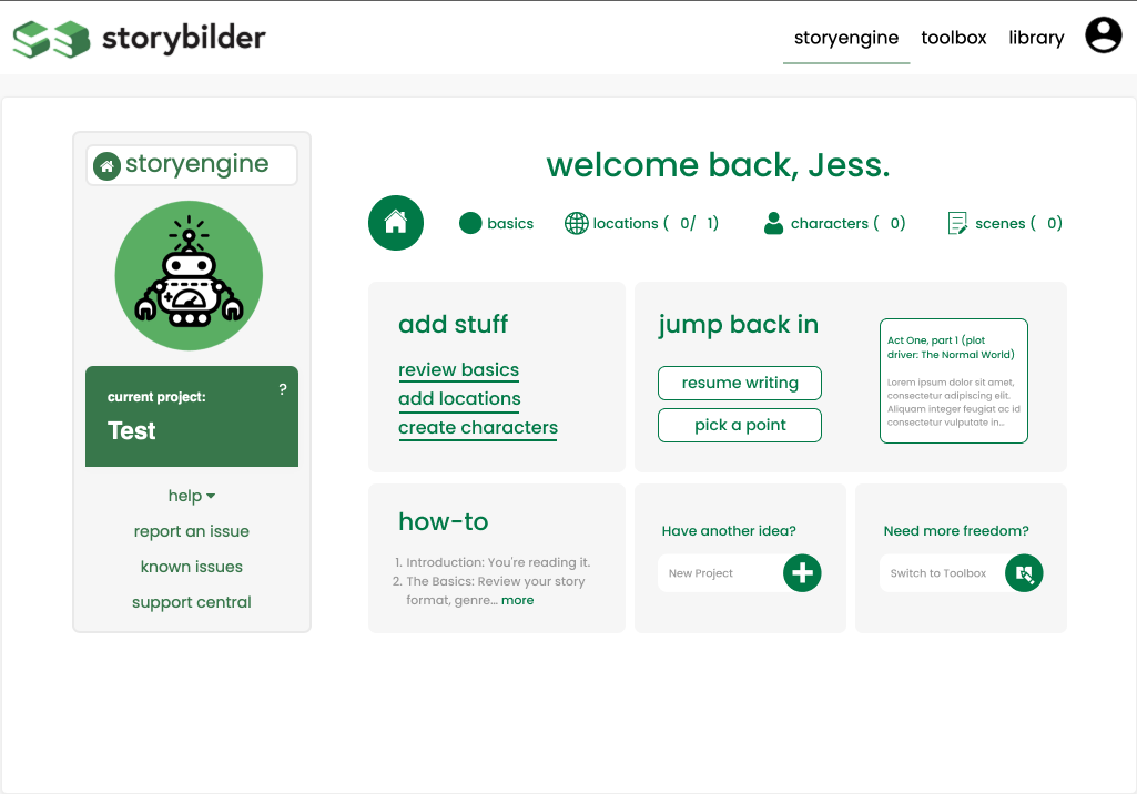
Mock 3 was built off mock 2, with an addition of the current project iconography links taking users directly to locations, characters, etc.
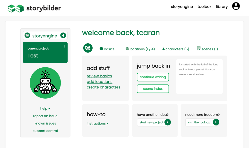
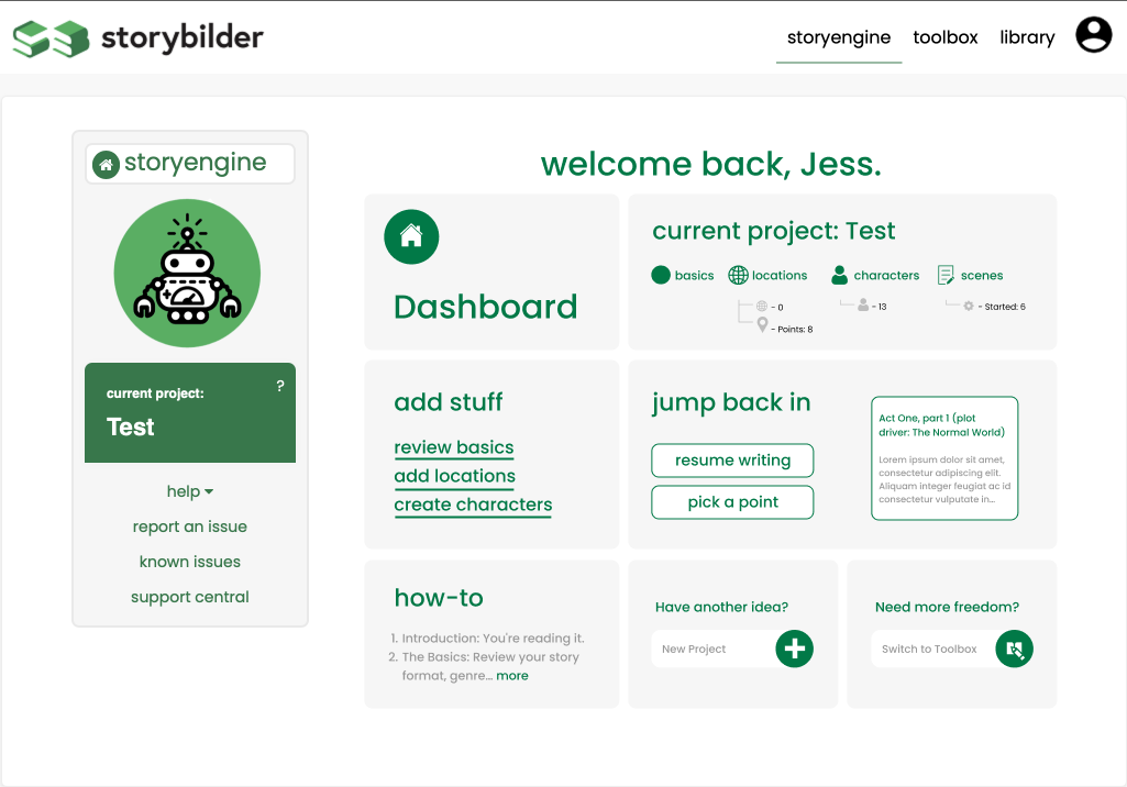
In the end the top row was discarded to keep to our ideology of simplicity to the StoryEngine experience.
Lo-fi of Flow 1: Add incompatible product to FridgeCompare Nutrition Levels

login

dashboard

quick add

barcode scanner

manual search

nutrition facts scan

scan results and manual correction

rewards for adding to Nutri database
Lo-fi of Flow 2: Compare Nutrition Levels
dashboard

comparison selector
week selections

comparison results

coach selections

comparison results