
The sidebar in context of the StoryBilder site is for user navigation through the writing platform itself. It acts as a detailed navbar to help people explore all that each tool in the "Trilogy" offer.
What's the "Trilogy" you're probably asking? Let me break it down as simply as possible before continuing:
1. StoryEngine: The entry-level writing environment with limited functionality to be least overwhelming.
2. Toolbox: The mid-professional level environment packed with tools to further improve and refine their work.
3. The Library: A constantly updating resource centre dedicated to providing users with plot structures, characters, maps, and more.
To save time, I'm outlining the redesign of the Toolbox sidebar specifically, with the others being simply displayed.
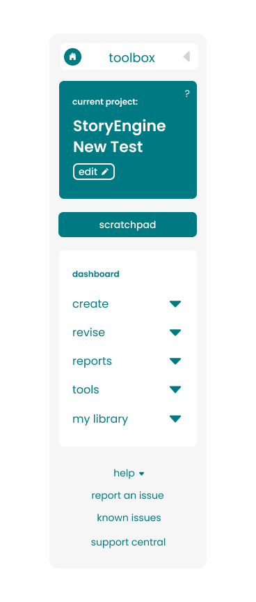
Displayed left, you will see the Toolbox sidebar fully expanded. Here was my overview of it:
For being intended toward mid-professional writers, it was important to pack as much functionality as possible. Keeping things simple and text-based was the right approach, although it felt a bit dated and disconnected. The ask was to keep the layout generally the same, with work focused on the design front.
So without further adieu, I got to work.
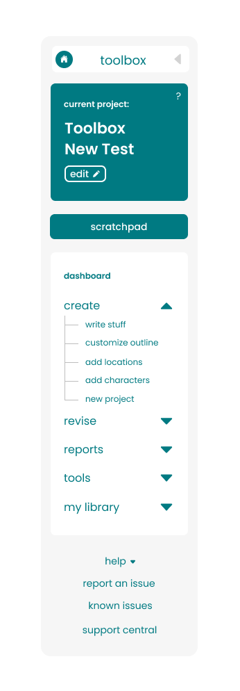

Initially I had tried some different colours and a line system to connect the points under each section, but that was opted out of. Here's are the changes made that I felt brought it a more current look and made it feel more seamless:
• Starting from the top I added an icon on the top left of the toolbox to help further identify which of the Trilogy they're in.
• On the right you'll find a caret that acts as the show/hide toggle. I believe that if it's obvious enough it shouldn't need explaining.
• Moving down I added an icon that was initially marked "edit" but was later reverted to "change" with a different icon.
• You'll notice in the main section we discarded the word "dashboard" since it felt redundant.
• Carets were also used in place of the +/- icons to unify and start correlating carets with that function on our site.
• The scratchpad was moved to the bottom as it was used less frequently, giving it lower priority.
• Lastly the help desk was condensed into a list as well with a caret to match, and the other buttons below given the same hierarchy in visual language.